

Beyond Liquid Glass: Apple's Transformations
Apple's new design system is a mess

Whether it's the jarringly dark Control Center on iOS or the out-of-place toolbars on macOS, most of Liquid Glass's current visual "missteps" can be attributed to the tight development schedule of Developer Beta 1, preventing the design from achieving its intended effect. Rather than showcasing a brand new visual language, it feels more like a solo showcase for Liquid Glass. While WebGL implementations have existed for some time, Apple's refraction and edge reflection effects are notably refined, striking a preliminary balance between aesthetics and performance. However, when integrated into the interface, background interference becomes a significant issue. In fact, the Liquid Glass material itself seems designed to accentuate background content.
A Brief Introduction to Liquid Glass
Let's directly consult the HIG for the Material section on Liquid Glass:
Liquid Glass forms a distinct functional layer for controls and navigation elements — like tab bars and sidebars — that floats above the content layer, establishing a clear visual hierarchy between functional elements and content.
Generally, Liquid Glass is used for functional and navigation elements, such as tab bars (iOS) or sidebars (iPadOS and macOS). It floats above the content layer, creating a clear visual hierarchy between functional elements and content.
In this regard, it doesn't differ significantly from previous standard materials.
Liquid Glass allows content to scroll and peek through from beneath these elements to give the interface a sense of dynamism and depth, all while maintaining legibility for controls and navigation.
Liquid Glass allows content to scroll and peek through from beneath these elements, imbuing the interface with dynamism and depth while maintaining legibility for controls and navigation.
This aspect sets it apart from earlier materials. One of Liquid Glass's objectives is to increase the perceptibility of the content beneath; previous materials with high levels of background blur diminished the presence of the content. By relying on refraction, a degree of blur, and edge highlighting, legibility is maintained. HDR highlights push color limits, and chromatic aberration and edge lighting add a personalized touch. However, the excessive brightness from HDR can cause glare, and its invisibility in screen recordings or screenshots significantly diminishes its practical utility.
It appears that Apple, which invests heavily in its interface design, is the one truly carrying forward the vision of Fluent Design.
However, Apple advises against overuse of the Liquid Glass material, stating that using it within the content layer adds unnecessary complexity. They also recommend against layering Liquid Glass elements, as this can lead to confused hierarchies. For other properties of Liquid Glass (structure, custom coloring, two variants, etc.), it's recommended to watch the video "Meet Liquid Glass".
This article primarily discusses whether this new design system, embodied by Liquid Glass, truly brings about a revolution.
A Vision-First Design System
The following screenshots are based on iOS 18.5 (iPhone XR) and iOS 26.0 23A5260n (iPhone 14 Pro) as references for the old and new systems.
I apologize for using Chinese interface screenshots here. However, it should not affect reading and understanding.
Upon opening iOS 26, one notices that the tab bars and toolbars of many system apps have been replaced with the regular variant of Liquid Glass material.
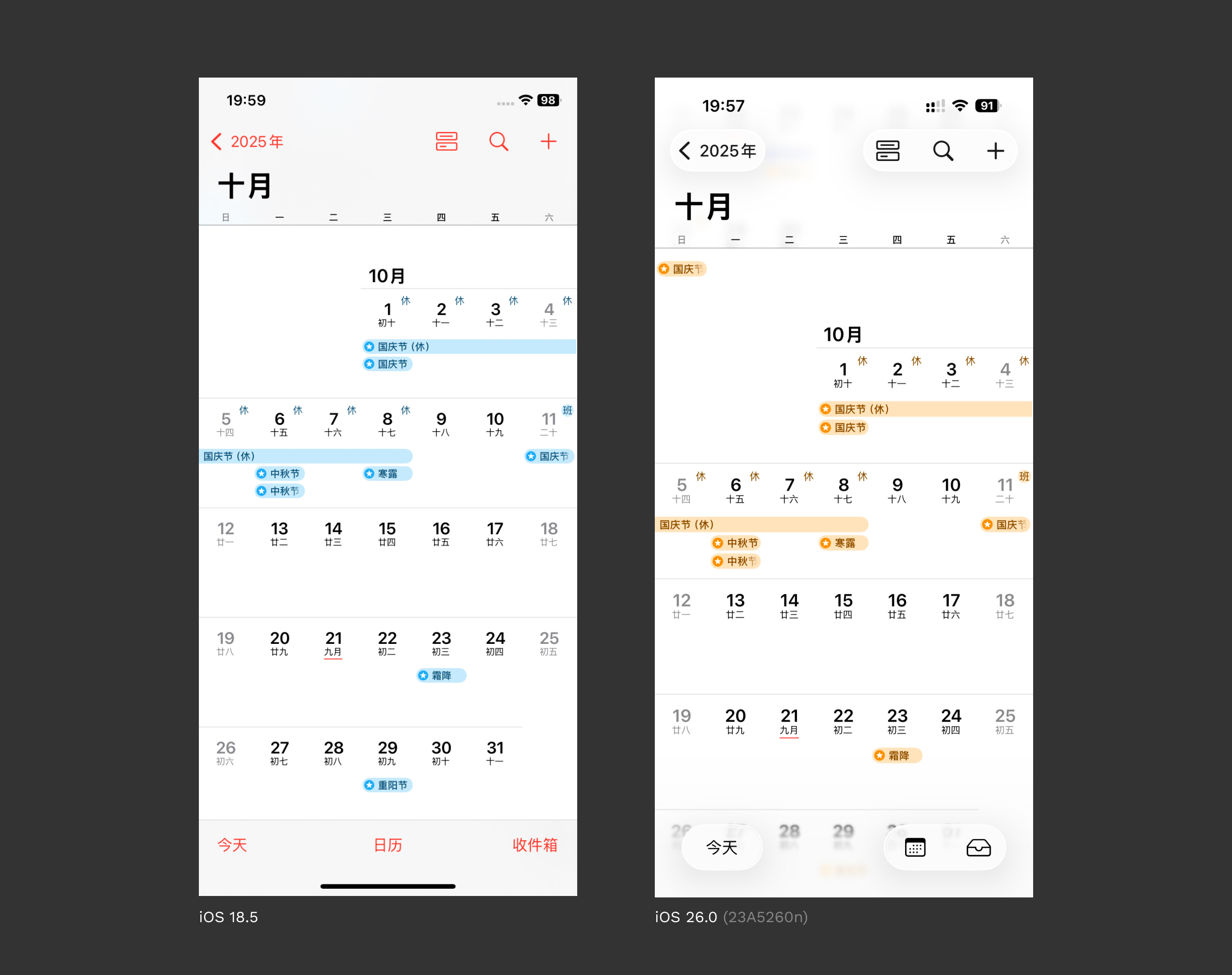
Apple advocates for using clear, unambiguous icons to largely replace text (→ detailed in Toolbars. If icons are ambiguous, text can be used (like "Today" on the left). However, it's important to avoid mixing text and icons within a single Liquid Glass element, as this can lead users to mistakenly interpret it as a single functional button.
We also observe the application of Scroll Edge Effects at the top and bottom of the Calendar on the right, which are essentially gradient transition effects. Most often, this is the "Soft" effect; on macOS (e.g., in Finder), the "Hard" effect is used to enhance contrast.
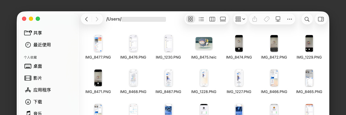
macOS seems to have been caught off guard by this transition. The sidebar and top toolbar haven't been fully adapted, yet they've been pulled along by iOS and iPadOS into this new look, and it's a rather ill-fitting outfit. On light backgrounds, to increase contrast, the opacity of shadows is increased. Additionally, because toolbars cannot afford to have excessive edge spacing and occupy limited space, combined with the overly narrow left and right padding within each tool group, this has resulted in the current awkward situation.
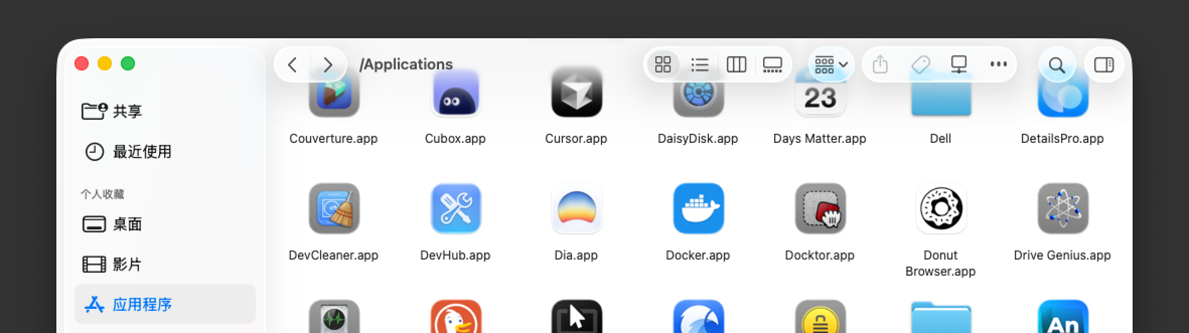
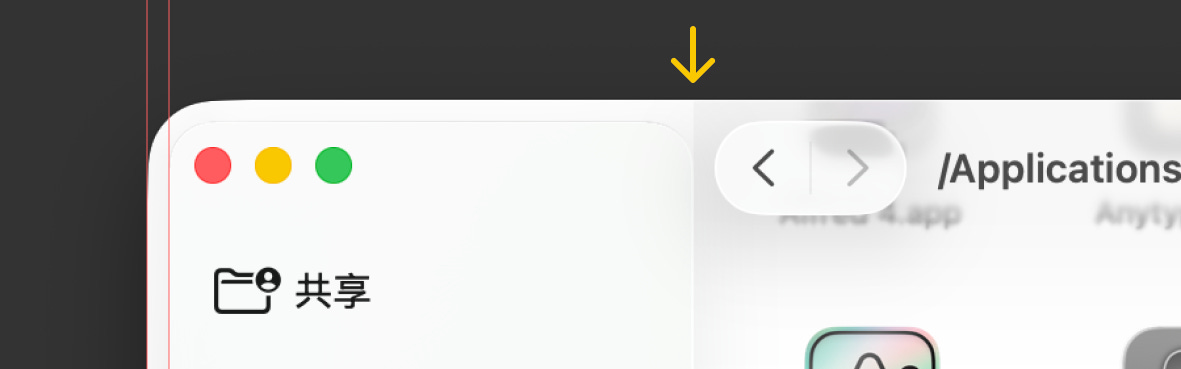
As the content scrolls, the shadows diminish, and the edge effects become more pronounced, improving the appearance. However, the internal spacing on the two edges of the sidebar continues to waste space, and the shadow clipping indicated by the yellow arrow are issues that macOS needs to address independently—the tight schedule is also a factor.
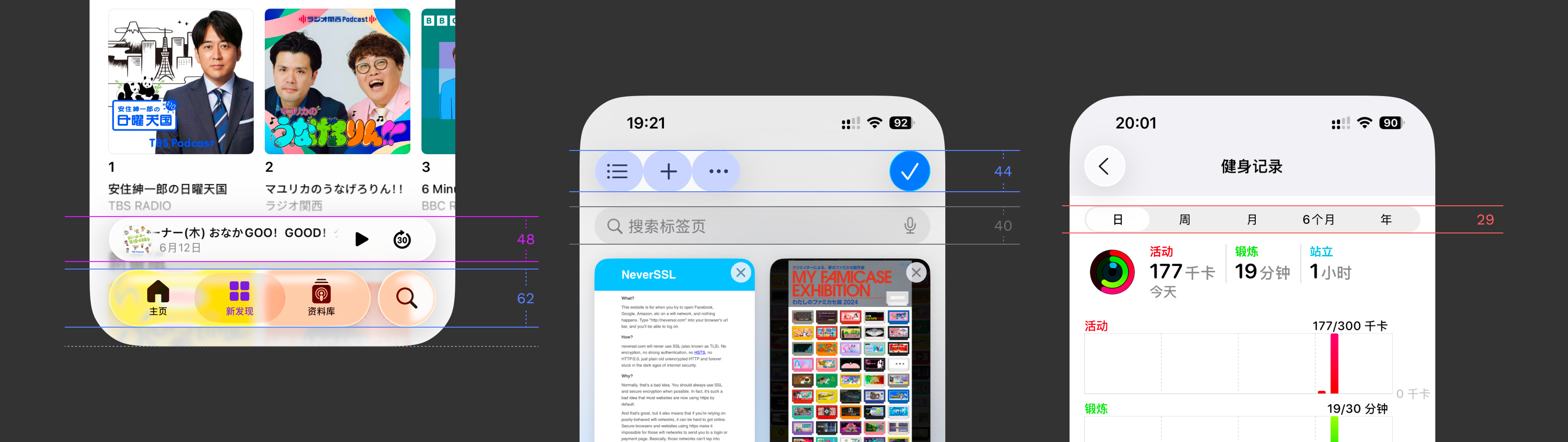
Returning to iOS, many apps have adopted the new Toolbars and Search fields guidelines, altering their tab bar and toolbar layouts. However, I question whether these are positive optimizations. First, consider the conventional layout changes:
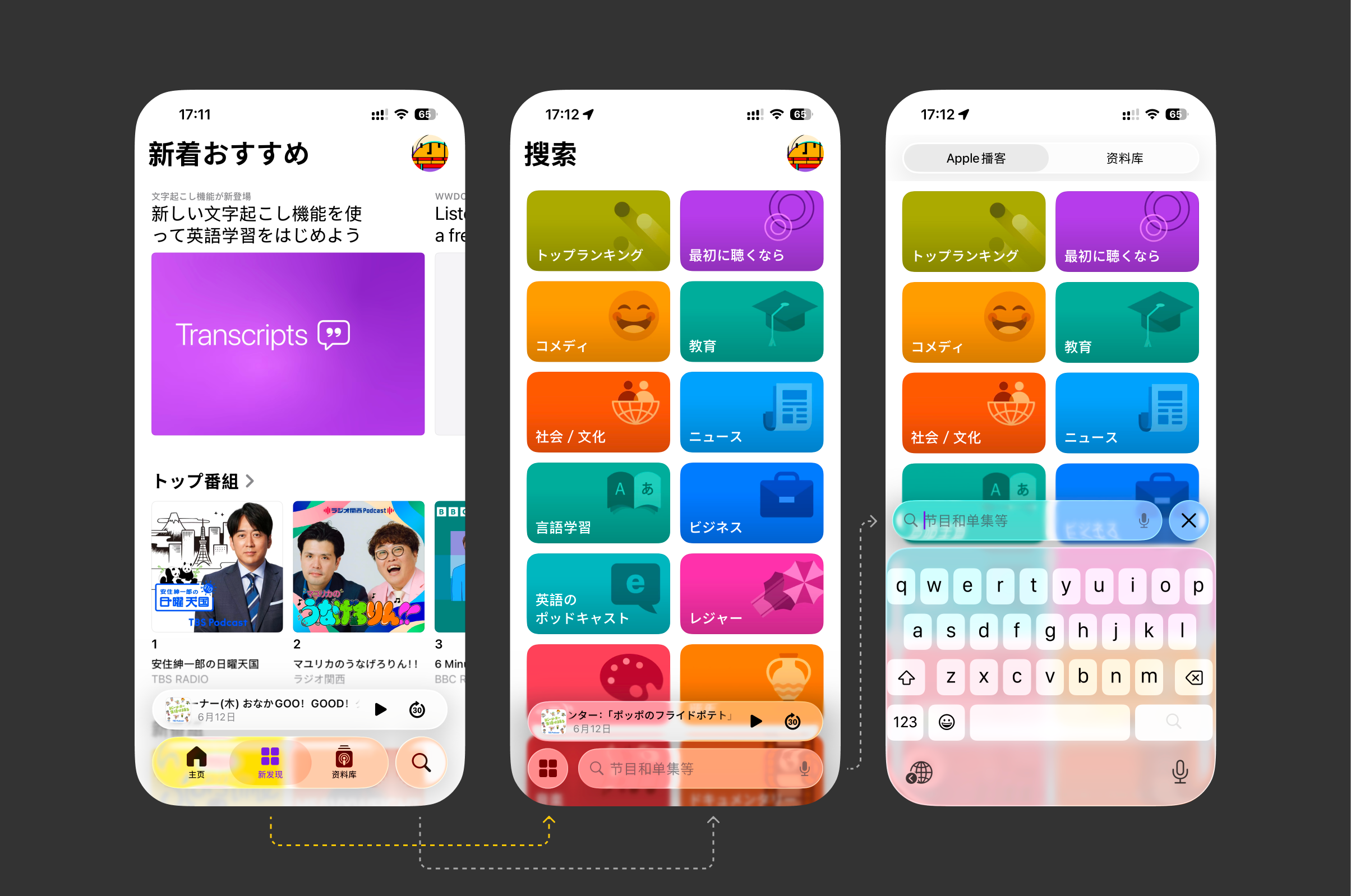
The tab bar and search are now on the same level. When you tap search, only the currently selected tab bar state is displayed on the left (middle image above). Tapping search again enters the search state (right image above), and tapping "X" returns.
Previously, when they were on different levels, users could tap to switch to other tabs while in a partial search. However, this has now become a single-threaded operation; returning from search to selecting a tab now requires two additional taps.
Given the current space available on the tab bar, it can typically accommodate about four tabs. If there are more, the last tab will become "More" to display other tabs separately (→ [see here](https://developer.apple.com/design/human-interface-guidelines/tab-bars#Best-practices)). The top left is generally used for titles to declare context, and the right for personal information. Apple advocates for simplicity, but many complex business apps find this difficult to adopt. In an era where screen real estate is at a premium in every corner, even a small and elegant app like WeChat might struggle to accommodate this.
Let's continue our skepticism.
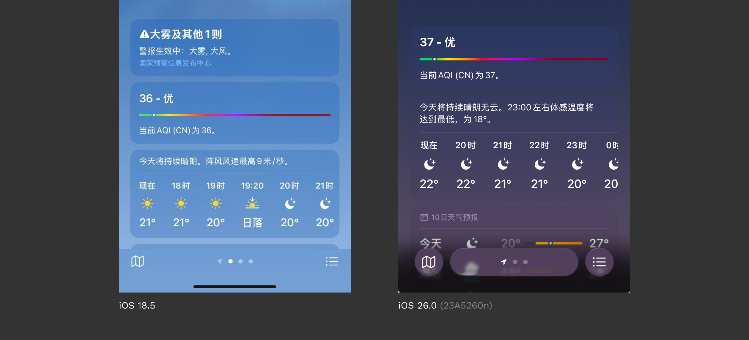
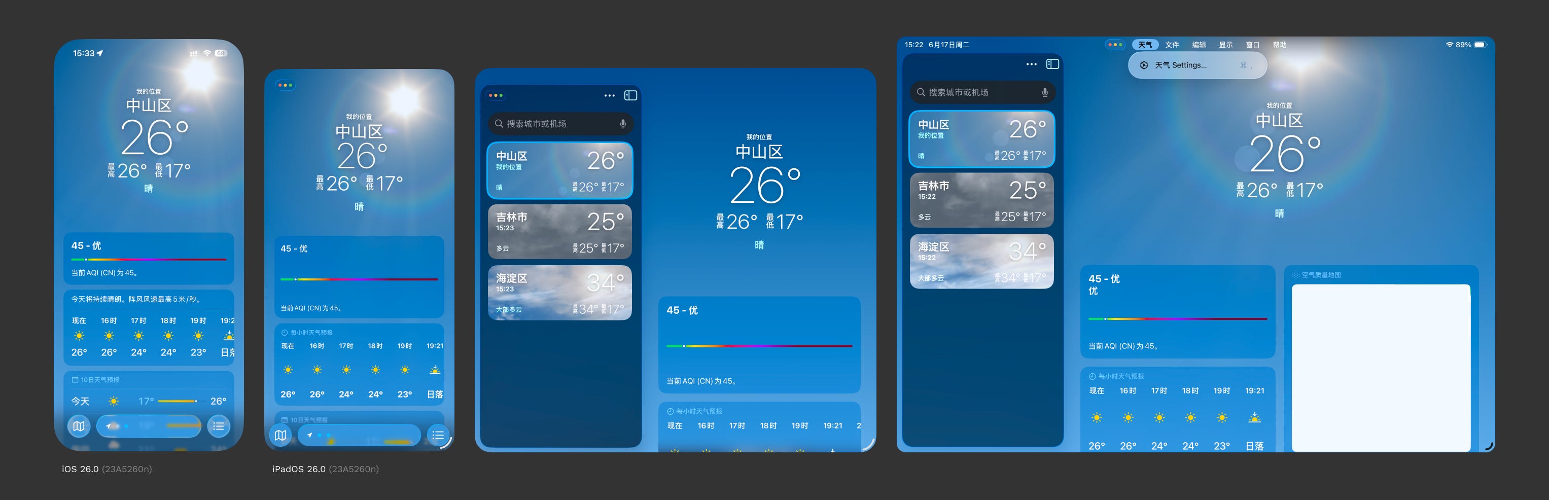
The previous pagination indicator at the bottom center has now been given its own grouping, resulting in a peculiar form. However, this actually inherits two hidden interactions:
Long-pressing navigates to the city list;
Tapping the left or right space allows for horizontal city switching;
But the current simplified form makes it seem like the intention is to tap the tiny white dots to switch, which is confusing. I believe it would be better to adopt the camera's bottom tab approach for switching city views—
The screenshot below is of the Reminders app, which lacks a tab bar.
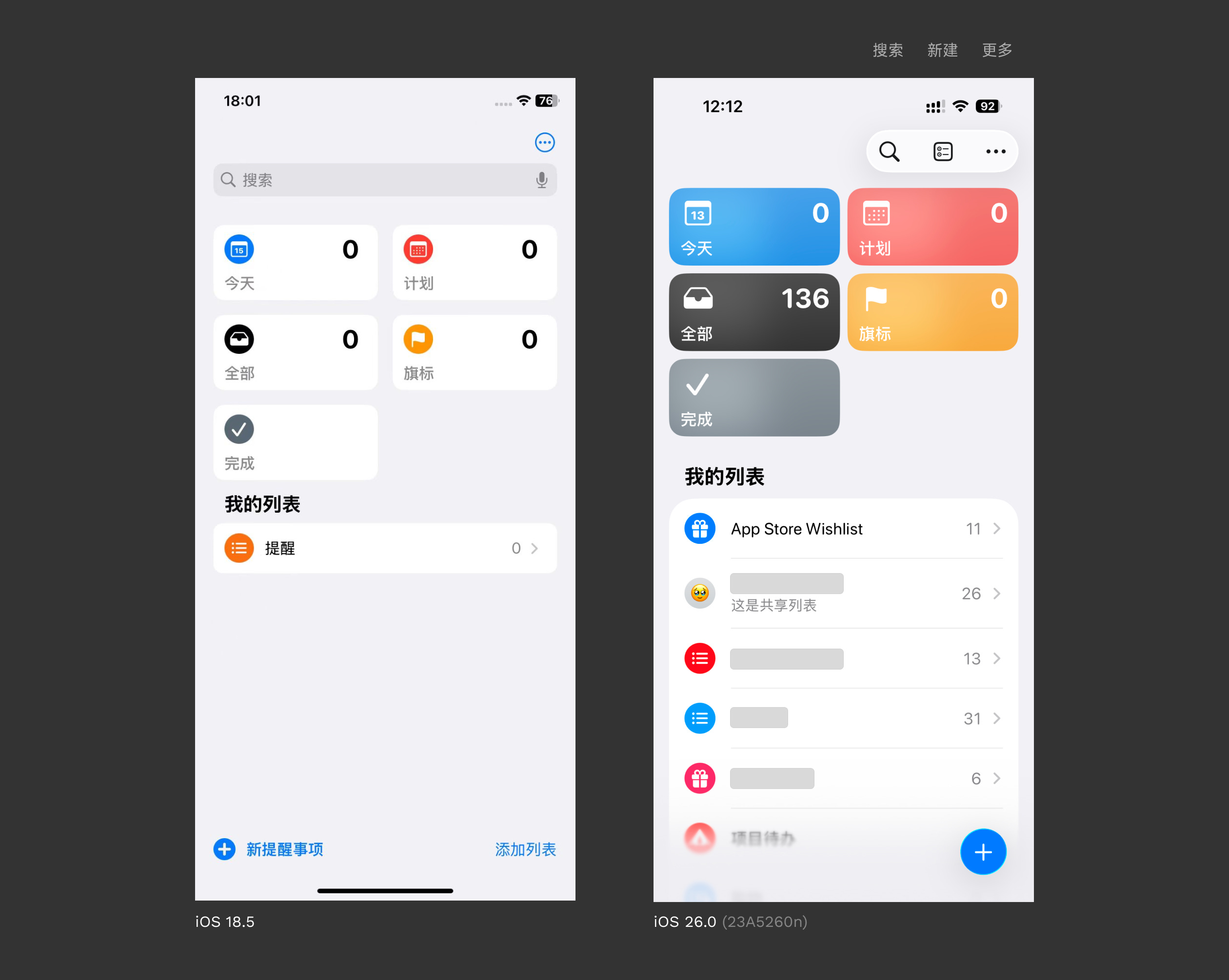
It feels as though Apple's design is akin to a malfunctioning robot, uncertain how to adapt to the current environment.
Search is not placed at the bottom;
The plus sign (for new reminders) is not in the top right? Although it seems acceptable in its current position, being a conventional area for a FAB;
The icon for "Add List" (middle top right) is unclear;
The overall layout could have easily followed the pattern of the Notes app as "homework," but Apple has not done so.
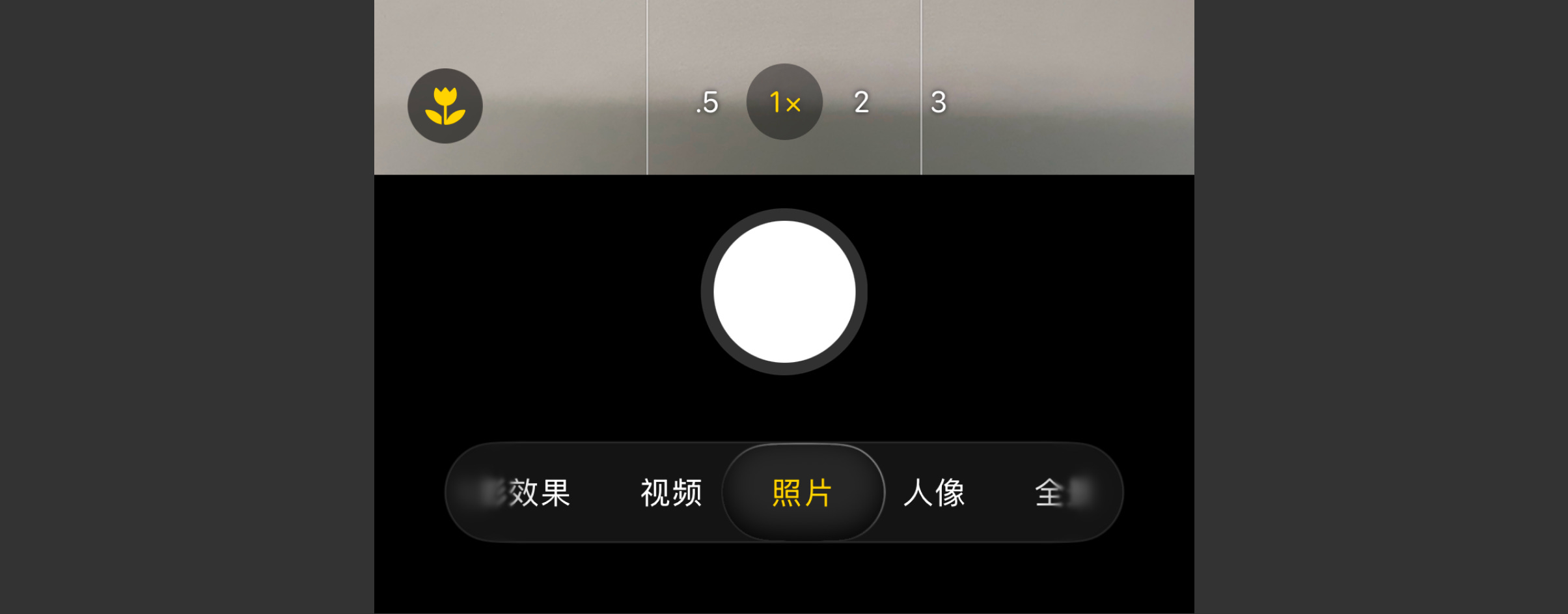
The screenshot below is of the Camera app.
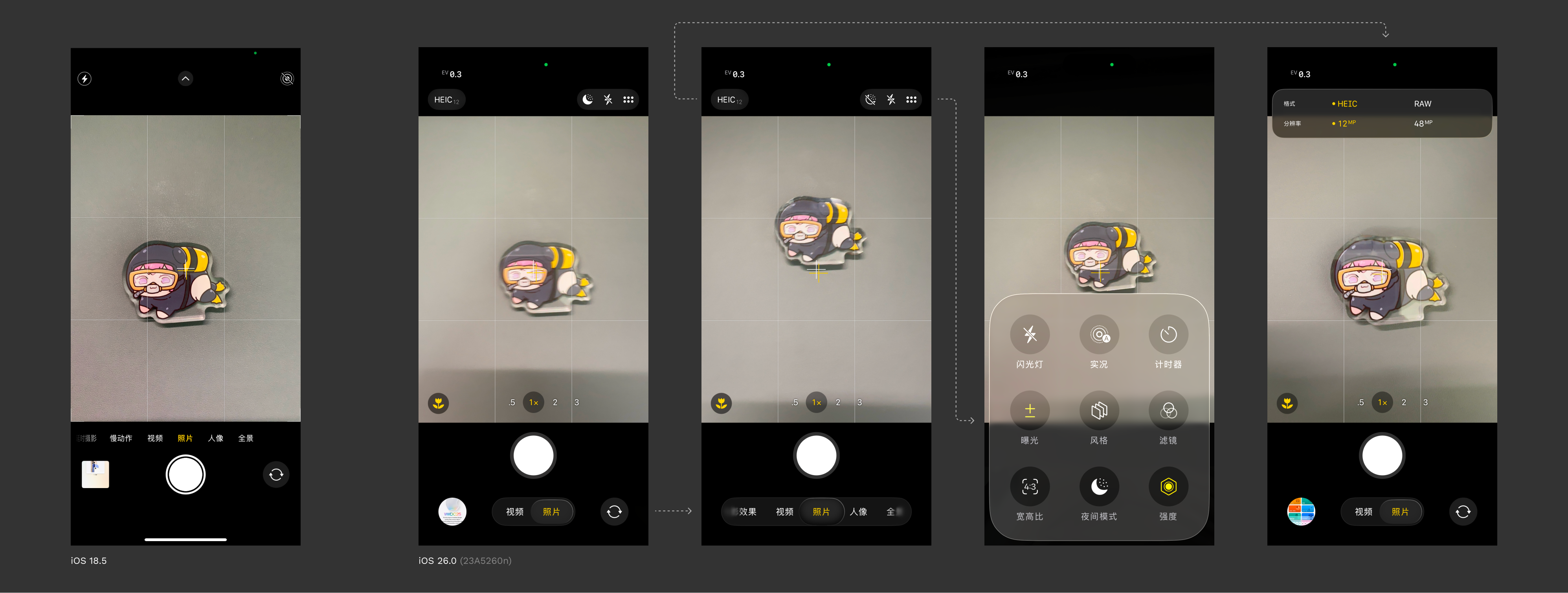
In iOS 18.5, you could clearly see the camera's shooting modes; after modification, only two can be seen at most. Don't worry, Apple has noticed this and implemented a process to compensate for user perception:
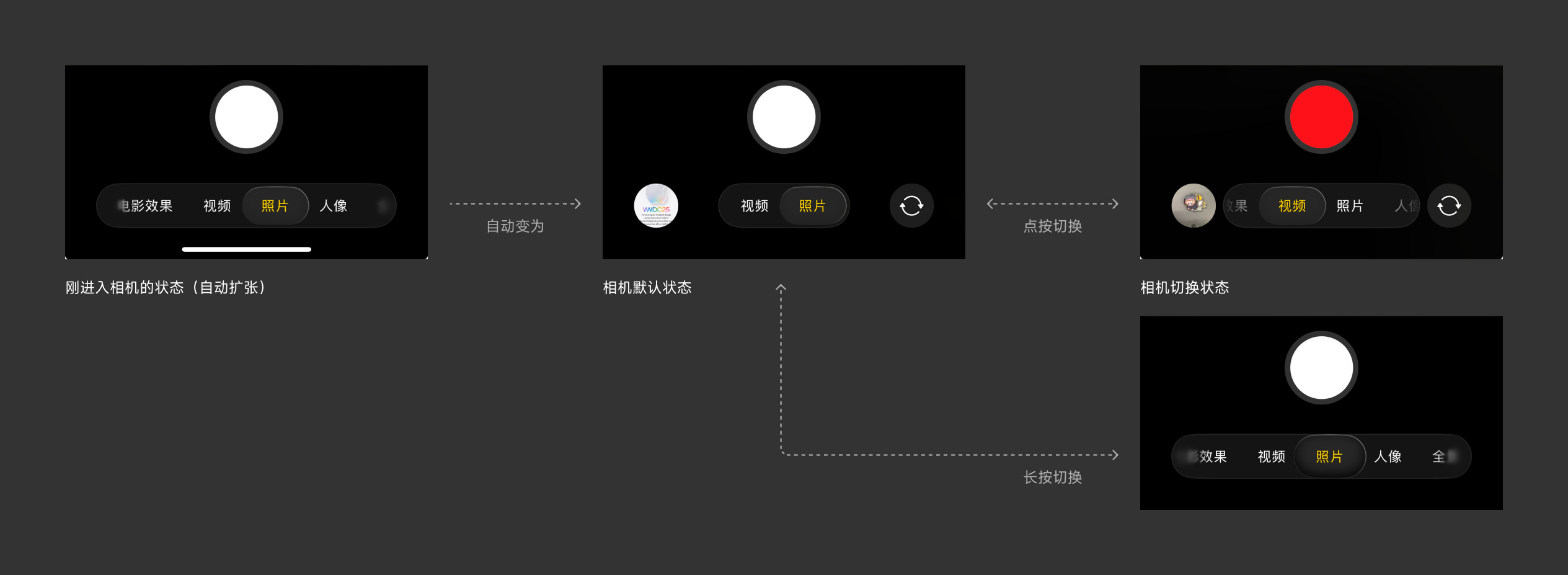
They've gone to great lengths for a small dish. Behind this forced display, one can see how rigidly the new visual specifications are being enforced. Developers vying for the next Apple Design Award will have a tough time; are they ready for a true test of user experience skills?
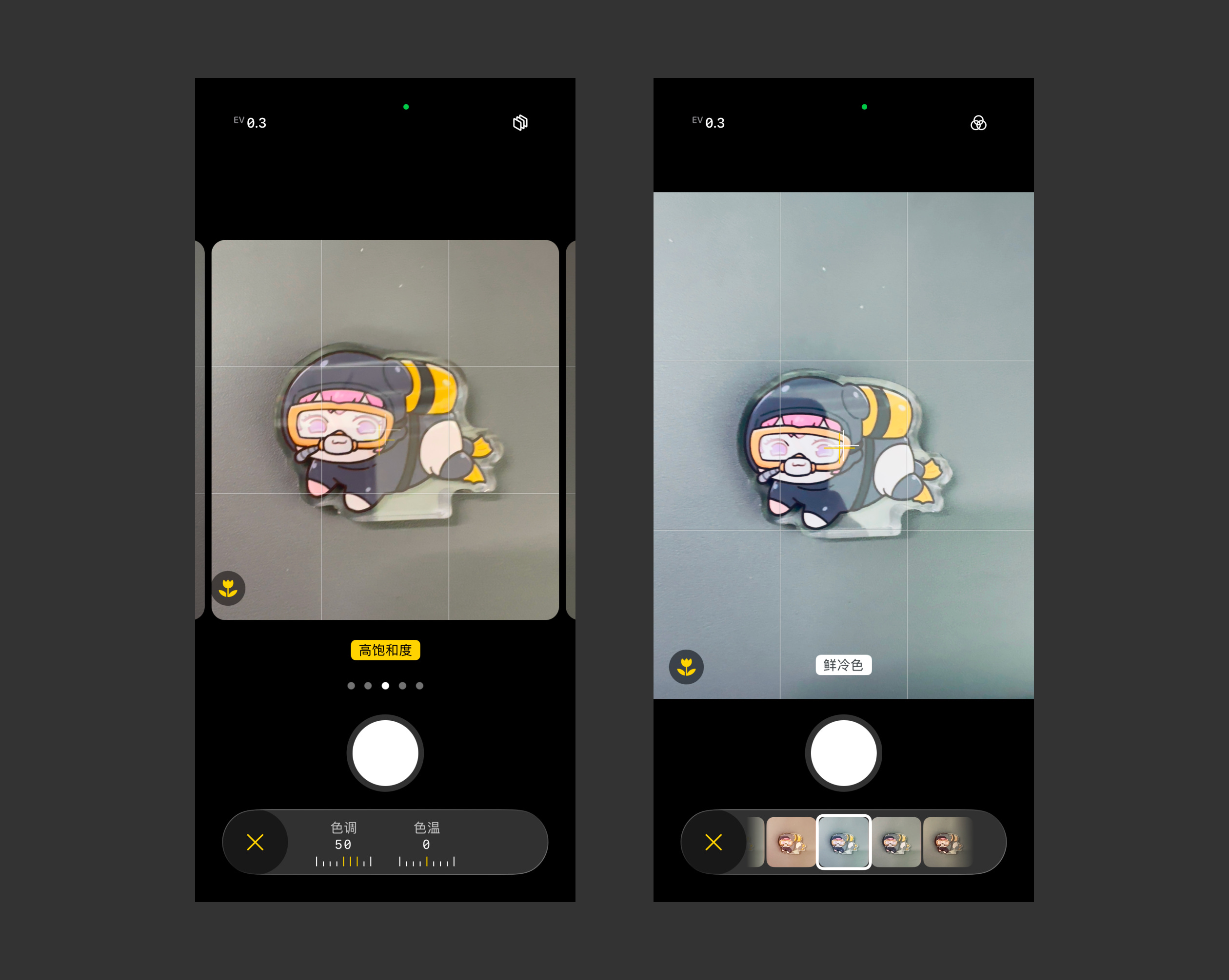
The toolbar elements on both sides of the camera at the top: tapping the left opens the newly improved "Action Sheets" mechanism—meaning pop-up locations are based on the action source rather than the bottom. However, when tapping the "six dots" icon for more options, a medium-sized Liquid Glass pop-up suddenly appears at the bottom (second from the right in the image above). This pop-up features nine functions with peculiar interactions: some are icon-based toggles, while others are like the image below:
I suspect someone internally is trying to revive the "swipe to unlock" concept—the circular "X" cannot be swiped—but I really want to swipe it.
Although the camera controls were previously well hidden, at least the interactions were consistent. Here, however, I only see compromise, compromise, and more compromise.
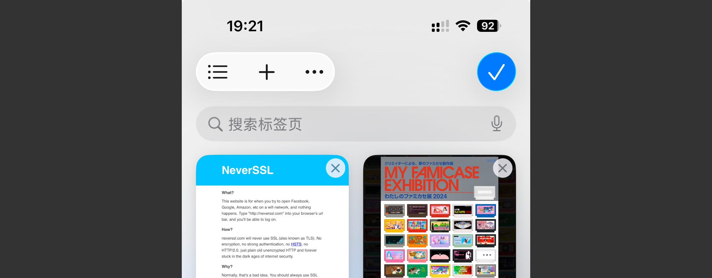
The first major redesign of Safari, moving the URL input bar to the bottom, was something I supported, and Apple's subsequent experience compatibility has been commendable. However, this latest change, I would call it the "pinnacle" of the new design language.
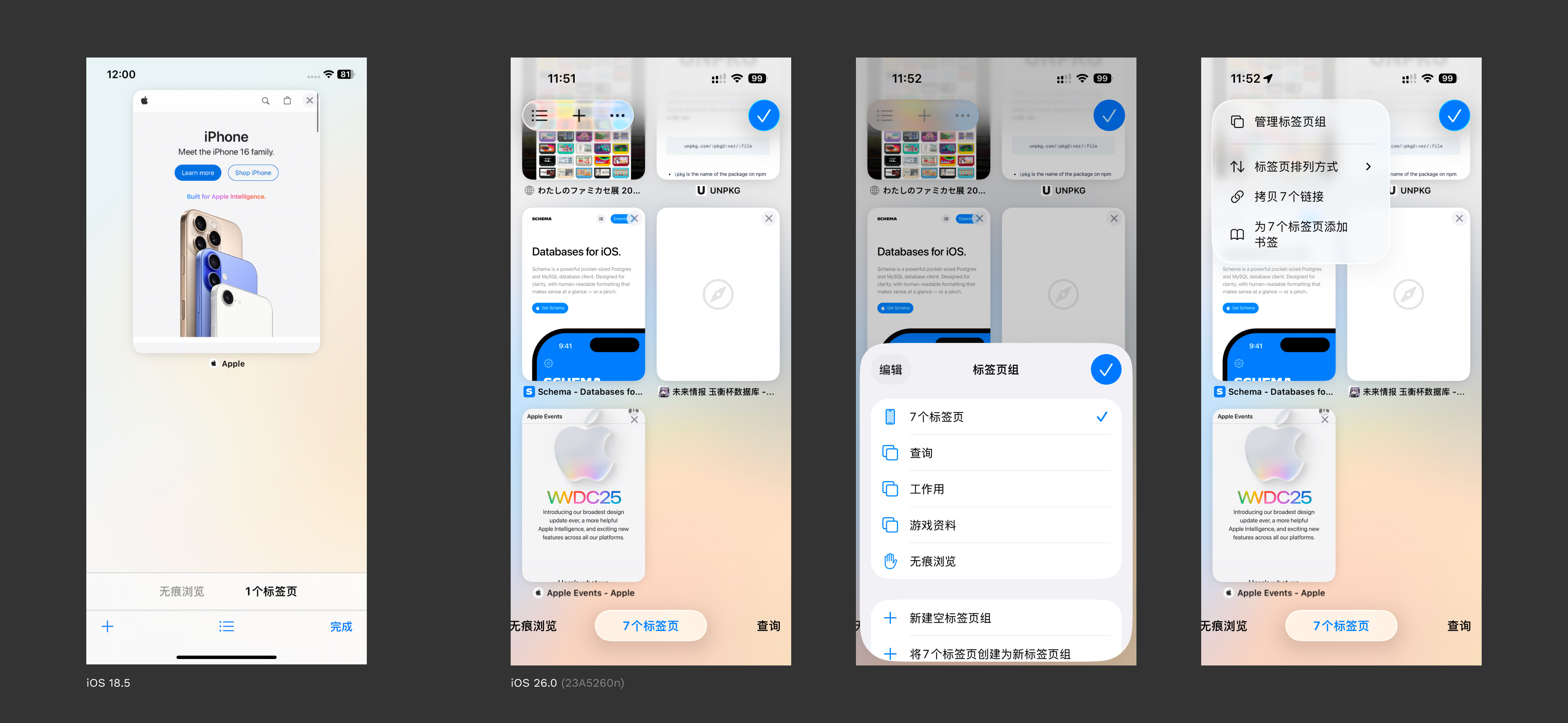
In this interface, the "plus" icon represents creating a new tab, the "list" icon represents tab groups (I still think this icon is not ideal, as it can represent too many things), and "Done" represents returning to the originating page.
For me, in this interface:
The "plus" icon is used most frequently, as most operations when reaching this tab preview page are for creating new tabs;
Next is managing other tabs;
Or switching tab groups;
The least useful is "Done," as tapping on the webpage also returns you;
However, in the new interface:
Tab group switching is placed at the most accessible bottom position;
The most frequently used "plus" icon is placed in an inconspicuous position in the top-left corner;
The least useful "Done" is placed in the most prominent position in the top-right corner;
Tapping the "ellipsis" icon brings up tab group management again.
You might wonder why "Search Tabs" isn't extracted as a separate search bar. Don't worry, Apple hasn't changed that this time:
Perhaps Apple realizes that the search here is not on the same level as the search on the app's home page; it's purely a functional search. However, if Liquid Glass is applied, the top toolbar icons would need to be grouped into sets of 4 to 5, which is not elegant. It's better to keep them hidden by default.
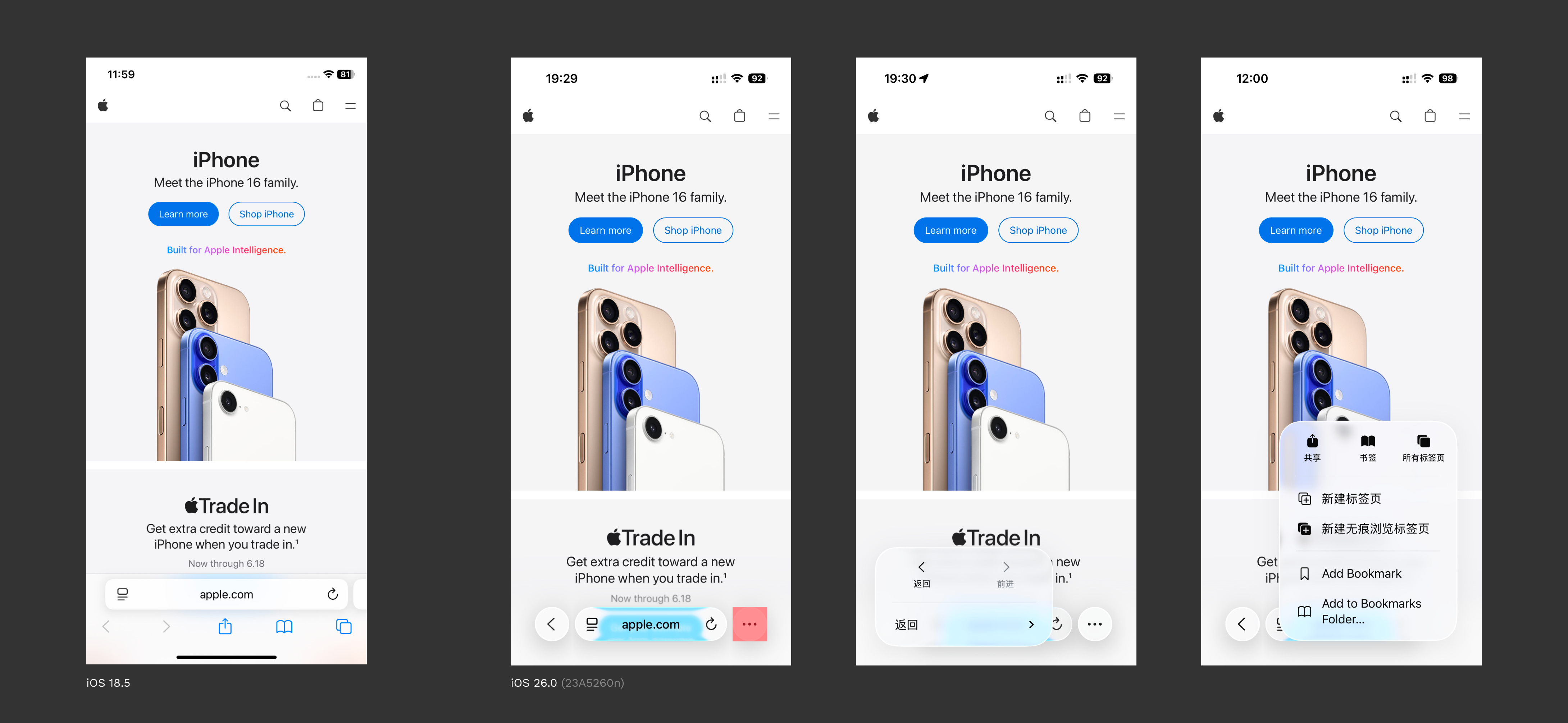
You can see that the iOS 26.0 version has returned to the iOS 15 design (→ recall here). This time, it retains the refresh (right icon) and menu (left icon) functions, along with the back button and the ellipsis icon to collapse all other operations.
To view all tabs, one must click the ellipsis icon and operate within a pop-up, or become familiar with the gesture of "long-pressing the address bar and swiping up." As for sharing operations, multiple clicks are required regardless. The "Forward" operation is also hidden within the menu accessed by long-pressing the back button. I have a feeling this design change might only remain in the early Beta phase to test user acceptance.
In my previous article, #81 Unbox: Quiche Browser, I introduced a browser with customizable toolbars. This current design can be considered a Liquid Glass version of that concept. Perhaps Apple believes excessive freedom increases complexity for average users, but excessive simplification leaves users bewildered.
---
The new Liquid Glass design language introduces a new "numerical inflation," which, more or less, increases the clickable area. This is a positive development.
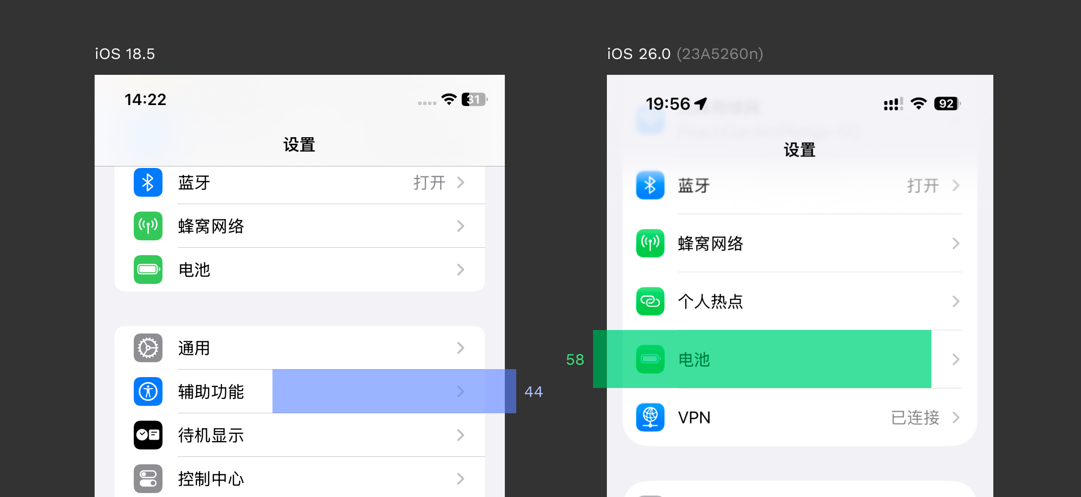
Ah, left alignment. My long-standing belief that left/right alignment of content paragraphs offers better readability than centered alignment has finally been realized. However, the height of some segment controls is quite low, and I hope Apple will make improvements in subsequent updates.
Looking Forward to the Era of Adaptive App Design
iPadOS 26.0 brings significant changes. It abandons the flashy interactions of previous split-screen modes, adopting a window design more aligned with macOS (→ see Split View for details). Users can freely change the aspect ratio of iPad apps using the handle in the bottom right corner (within certain limits), and window control indicators and menu bars have been introduced.
This doesn't seem entirely similar to web adaptive design; sometimes, app structures need to be reorganized to accommodate sidebars. iPadOS previously had sidebars as well, but this visual alignment with macOS offers greater uniformity and freedom. Looking back, when iPads ran iOS apps, they could only be enlarged or shrunk within a black screen. Now, even non-adapted apps can run in windows (proportionally).
In Summary
We are currently in an era of technological transformation driven by AI. Apple, after a year of AI setbacks, must reintroduce the "Only Apple Can Do" magic by bringing shaders into front-end technology to forcibly achieve this goal. However, it appears that neither people nor machines were fully prepared, leading to hurried fundamental experience changes that feel out of place in an app environment that has evolved for decades on mobile.
As for macOS, oh my goodness, they've modified all non-standard app icons by default. What else is there to say?